Do Trends Matter in CPG Design?
- July 23, 2024
- Knowledge Base
- 0 Comments

Graza. Fishwife. Brightland.
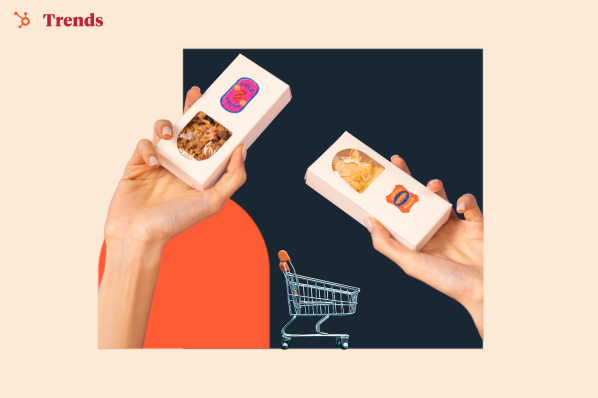
If you’ve never heard of them, just walk into a local specialty store — you’re guaranteed to spot some of these brands, with packaging so aesthetically pleasing they make you feel like walking inside an Instagram feed.

Gander helped build the Graza brand from scratch, an olive oil that comes in a squeeze bottle. Source: GoPuff
Marked by bright colors, bold fonts, and creative illustrations, this style of packaging is now moving beyond specialty stores and into big retail aisles.
“If you walk into almost every major retail chain grocery store in the US, there would be at least one product that we designed, if not two.”
That was Mike McVicar, co-founder of Gander, a Brooklyn-based design studio behind Graza, Magic Spoon, and a dozen of other “viral” brands.
I tracked him down after obsessing over Gander’s visual style, and asked him about the latest trends in packaging design.
Except he’s not a fan of following trends or virality — not surprising for a die-hard creative.
“We get all the time that our work is trendy and that we’ve set a certain visual tone with our work, but we don’t intentionally do that,” Mike confessed. “It can feel limiting and annoying sometimes.”
But he still shared his take on why we’re seeing this phenomenon.
The Design Pendulum
Back in the late 90s and early 2000s, good design wasn’t a priority for consumer packaged goods (CPG).
Packages with call-outs and stickers that scream “33% less fat” were the mainstream, a style that Mike endearingly described as “over the top, ugly, and kind of extra.”
When the 2010s rolled around, branding design went to the other extreme — the blanding trend.
Packages became minimalistic and generic, often featuring sans serif fonts and pastel colors.
.png?width=625&height=352&name=The%20compound%20benefits%20of%20note-taking%20(9).png)
And now with the rise of social shopping, many brands are catering to the dopamine-charged, color-forward Instagram aesthetic.
It’s also a renaissance of the Y2K style, with bold colors and playful textures.
“The pendulum has swung toward ‘it can be fun again!’” Mike said.
Big brands love this trend, too.
From Jell-O to 7UP, they’re redesigning to dial up the dopamine, and creating a visual identity that spreads fun and joy.
The Downside to A Trending Style
The problem with this trend?
It has led some companies to prioritize “doing it for the ‘gram” when they come to Gander.
“You find brands that just have very decorative design, or only feel interesting aesthetically. It won’t pay off for them in the long run, or even in the short run,” Mike said.
It’s problematic for brands to emulate what everyone else is doing, or recreating a trend, because:
- You’re assuming that someone else’s solution is your solution
- You’ll be easily replaceable
- You’re not focusing on communicating your own brand values and differentiation to customers
He also doesn’t believe the current dopamine packaging trend will stay for that much longer.
It’s a pendulum, after all.
Differentiate Brands Through Design
Back in 2015, Gander worked on the rebranding for Banza, a pasta made from chickpeas.
Contrary to the popular style on the pasta aisle back then (think Barilla’s simplistic blue packaging), Gander went for a bright and expressive style.

Source: Gander
Banza was one of the early brands to make a bold statement with packaging, which impacted the food industry as a whole.
“Our ethos was to take an alternative food, and turn it into a brand that has subverted what was expected for gluten-free pasta,” Mike said.
And it worked.
Banza went from anonymity to one of the top pasta brands in the US. It’s now in 25k retail locations nationally, including Target, Walmart and Costco.
Since then, Gander’s helped many other CPG brands get on big retail shelves. Graza, whose design they helped build from scratch, hit $48m+ in revenue and can be found in 13k+ locations.
Looking back at their big wins, Mike gave three simple tips for any brand who want to stand out through design:
- Start with your story and history as a brand, instead of following trends blindly;
- Understand who your customer is, what kind of world they live in aesthetically, and what’s pleasing to them;
- Look at your competition, and see what opportunities align with your product and company that others aren’t doing yet.
What Else Is Trending in CPG Design?
As anti-trend as he is, Mike did get excited about one particular trend — the inclusion of “next-level delicious food photography” on packages.

The “bleh” to “yum” transformation. Source: AdWeek
You’d think it’s a no-brainer, but a decade ago, it wasn’t mainstream to put high-quality food photography on the packages.
“It never prints right, it doesn’t look that great, and the investment of creating something really good can be difficult for small brands,” Mike said.
But the tide has shifted.
Influenced by social media, younger consumers prefer packaging that actually stir up their appetite, and major food brands are trying to make their products look extra tasty.
Now that’s a trend we can all get behind.


